
Introducing: ExFatloss TEE & Macro calculator
Mostly TEE at this point, mostly

tl;dr: This weekend I made an online calculator to estimate your TEE as compared to the existing DLW database.
Check out the ExFatloss TEE & Macro calculater

As you might know if you read this blog regularly, I have recently been quite interested in the Doubly Labeled Water method. This is a scientific method to measure people’s actual, real-life energy requirements, not in a lab, not sitting on a couch.
After listening to podcasts with John Speakman and reading Herman Pontzer’s book Burn, I recently did my own test - and the results were confusing, maybe wrong. Allegedly, I burn over 4,600kcal/day being mostly sedentary.
I often find myself in discussions online, with people who have very strong opinions on how many carolies an adult person should consume or needs to consume.
In my opinion, people have vastly low estimates. Adult men working out 5x/wk claim to only need 2,000kcal/day. That seems extremely low to me.
Burn Burn Burn
And, luckily, I am proven correct: This paper by Pontzer et al [2021] has a very neat graph of all the data points they measured using the DLW method.
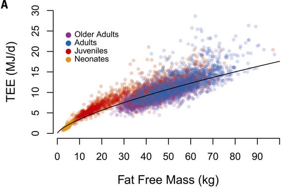
I’ve been posting this graph all over the internet for a while now, usually in a version that is annotated with kcal instead of MJ. I suppose scientists like megajoules, but I have yet to find somebody from any country who counted joules, not calories.
Muh calories
The version I’d been using was made by Twitter user @richcollins and looks like this:
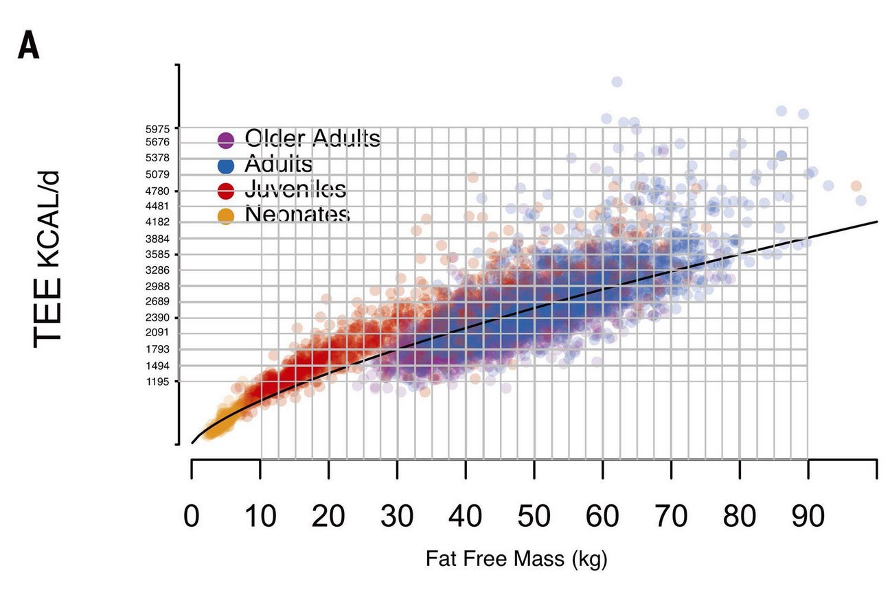
As you can see, Rich essentially drew lines over the graph and converted the megajoules on the Y-axis into the more familiar kcals.
And now we can see who would be expected to burn around 2,000kcal/day: a person with less than 40kg (88lbs) of fat free mass, i.e. a very small woman or a child.
Reports of adult men with significant muscle mass, working out several times per week and eating only 2,000kcal/day for long periods of time, should thus be viewed very skeptically.
As you can see there is some individual variance, but only to a point.
The ExFatloss TEE calculator
In any case, I had always wished there was an easier way to communicate on this topic than to copy & paste a screenshot from a paper with some lines drawn onto it.
Luckily, Pontzer’s paper explains the formula they arrived at, describing the average TEE (in megajoule) for any given Fat Free Mass (FFM, in kg):
TEE (MJ) = 0.677 * FFM (kg)0.708
Given this formula and the graph above, it was pretty straightforward to create a calculator.

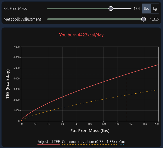
You can set your fat free mass using the top slider. I’m planning on adding a way to just enter your total body weight & body fat %, in case you don’t know your fat free mass.
You can select either pounds or kilograms.
The red line is the exact same curve as in Pontzer’s study, and the blue dashed lines show where you are on it: connecting from your FFM on the X-axis to the expected TEE on the Y-axis.
The two dashed, yellow lines indicate the typical range. How did I arrive at those? Well, it’s simple, really:
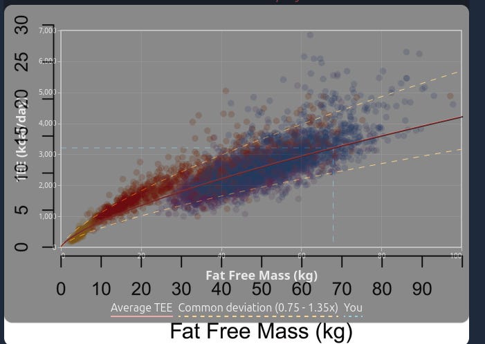
That’s right, I just overlaid my own graph over Pontzer’s and then tuned the yellow lines until they matched pretty well. This turned out to be 0.75x for the lower end of the range, and 1.35x for the upper range.
You could argue that these would underestimate toddlers (the red dots) and very tall/muscular people (right 1/4 of the graph), but I’d say that overall, it’s a good fit.
There sure are a few people burning slightly less than 0.75x of the average, and there are quite a few crazy-high outliers that are way over 1.35x. But they are pretty rare, and almost everybody would find themselves within that range.
As an example, take me. The DLW test indicated I have 154lbs of fat free mass, and even my “way too high, probably a faulty test” result of 4,600kcal/day TEE is only slightly higher than 1.35x at about 1.4x.
Copy & paste your values
Another thing I wanted was the ability to copy & paste direct links to numbers on the graph. When copy & pasting the image, the recipient would have to open the image, start reading the graph, realize that I was asking them to go up from their FFM to the line, then to the left until they saw the tiny kcal numbers there… it was quite involved.
My hope is that this will allow people to simply paste the URL on Twitter or Reddit or similar, and anyone will be able to see that exact position on the graph.
For example, clicking here should lead you to exactly the graph in the screenshot above, with 154lbs of FFM and 1.35x metabolic adjustment selected.
Macros?
There currently isn’t anything besides the total calories, but I plan on adding a bit more soon. For example, people love to talk about their protein intake as a % of their total caloric intake. Yet, mysteriously, those same people seem to have an extreme disconnect in what that actually means.
Hopefully, the calculator would be able to easily visualize how changes in protein intake and TEE influence each other.
In the meantime, feel free to play around with the TEE, and please let me know if you have any feedback or ideas.
Like others here, I'd be delighted to eat as much calories as the tool suggests I should (2800 for a tall and somewhat muscular woman). Yet, of course, I'd go very fat very fast if I actually did that (have tried). With a metabolic adjustment of 0.75x I get to the figure that some other online calculators tell me I should consume to stay at the same weight (below 2000, which feels like A Diet).
This is great. My result would be around 3500kcal, which would be a dream....I would mean I am in a deficit almost 100% of days. But now I am extremely puzzled why I lost only 3kg of body mass when restricting calories to 1800kcal per day while working out hard (but not adjusting for exercise calories) for three months. Just doesn't make sense....even in the traditional model I should have lost 6-8kg and according to this model I should have lost way over 10kg with that regime. How would you possibly explain that? A very slow metabolism? Loosing muscle mass then building it up again because I was in a way too big deficit?