Losing Weight with Unix: How I track All the Things
It's a Unix system! I know this!
I’ve received a few questions about weight tracking, which software I use, and so on. This post is probably pretty technical in the programmer sense. If you don’t care about that sort of stuff, this might be boring. Sorry.
Note:
You don’t have to build your own byzantine system of weird programming artifacts to lose weight. All you need is a scale, maybe a tape measure if you feel like it, and a text file or spreadsheet if you’re feeling fancy.
Just weigh/measure yourself every day, write it down. Make a graph, see what works. You can use Microsoft Excel, Google Sheets, or, if you don’t have access to those, LibreOffice, which is free.
Or you just write it down in a text file/physical notepad and use that.
Edit: a reader has suggested that Cronometer has a weight tracking tool with nice graphs, so you could try that.
Byzantine Generals Shell Scripts
In short: I use a collection of random shell scripts, written in different programming languages, that have evolved over a decade or so.
There is some sort of system behind the chaos. All the scripts crudely fit into a simple Input → Data storage → Output pattern. They all take text as inputs, and produce text as outputs. This way, they can be put together and combined as necessary, like lego pieces. The only difference is the `graph` script, which takes tabular text input and outputs a picture of said data in a graph.
If you don’t know what a shell script is: it’s a series of commands, written in a programming language, that tell the computer what to do. It lets you automate tasks very easily.
What’s a Unix system? One of two families of modern computer operating systems, the other being Windows, or whatever they call it now. If you use a Mac, you’re using a Unix system under the hood. If you’re using Windows, godspeed to you, my friend. If you use anything else, you’ve skipped this paragraph anyway, and your email client won’t render any of the pictures in this post.
Input
I have two main scripts to input data, and one third-party data source, my Continuous Glucose Monitor.
today - daily tracking script
I use this for weight, waist circumference, and wake up time. It can also record other data, but those are the 3 I’m currently tracking. In the past I’ve also tracked total sleep time, habits I was trying to entrain, and more.
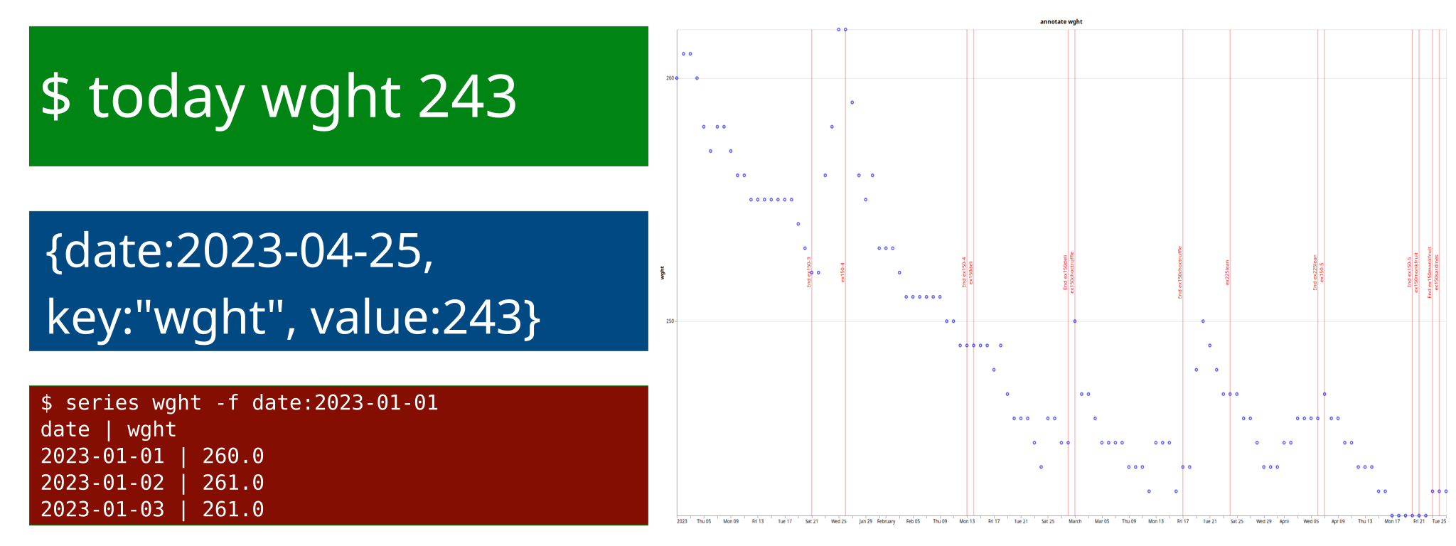
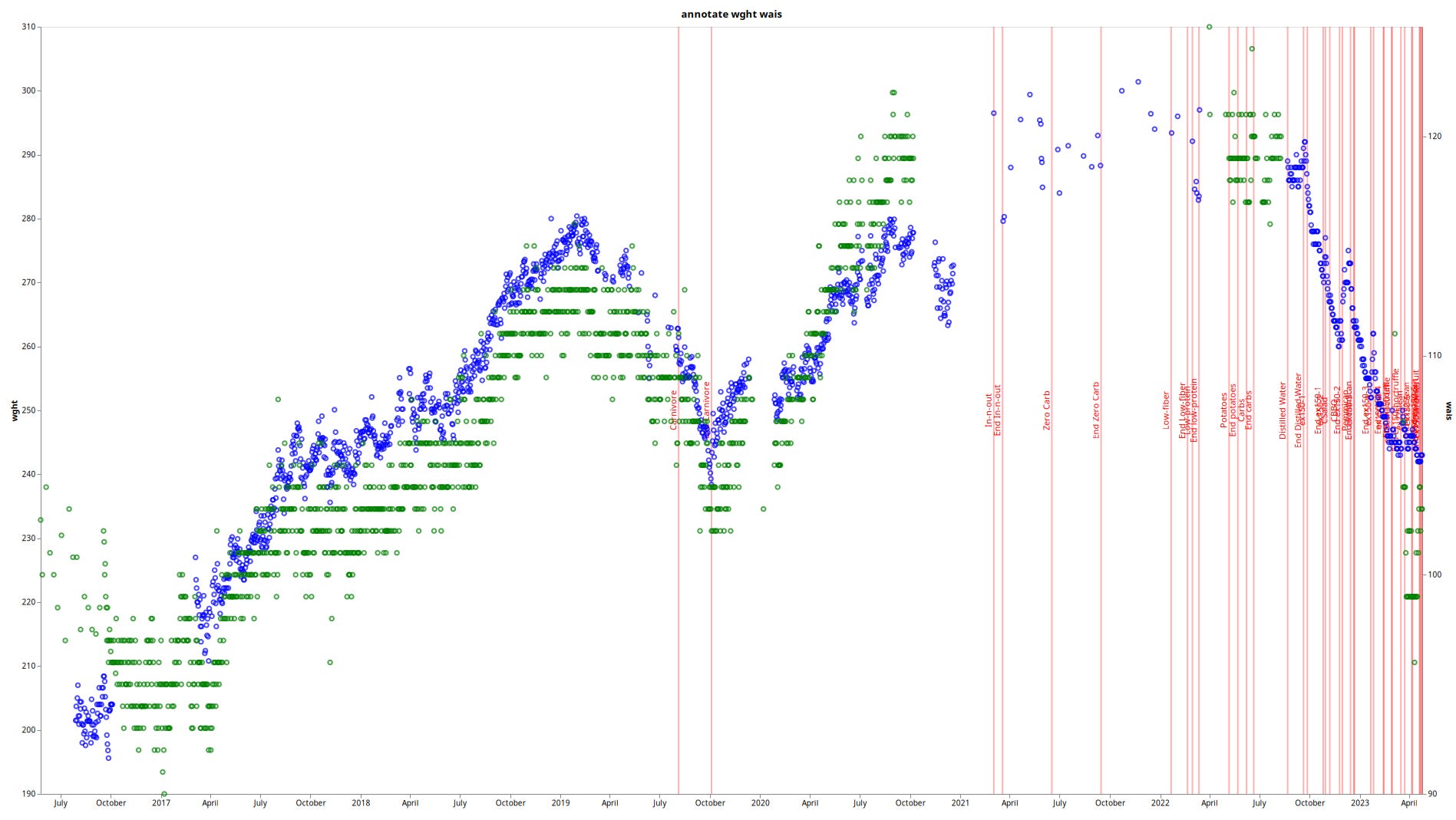
This script also tracks what I call “annotations” - markers to remind myself later. These are the red markers you see on my weight charts, noting e.g. the beginning/end of a diet experiment.
Example usage:
today wght 243
today wais 103
today annotate “D.End ex150-5”
As the name implies, the script will take a key (e.g. wght) and value (e.g. 243) and store them under today’s date.
The data is stored in a simple JSON file. I could stick it into a database, but this works. Since I only accumulate about 3 data points per day, this file is never going to get very large. I started it in 2016, and it’s about 500kB in size now.
cgm - granular, timestamp-based tracking
More granular script for CGM values, e.g. to track drinks/meals/walks. Since there are more than 1 eating/drinking/walking events per day, I needed to store an arbitrary number per day, by timestamp. Otherwise it’s nearly the same as the `today` script. It also stores the data in a JSON file.
Example usage:
cgm -n “Starbucks latte”
cgm -t 9:43 Walk
cgm -t “2023-04-25 20:45” “Whipped cream”
If you didn’t guess, `-n` stores the specified annotation for right now. If I didn’t put something into the system at the exact time, but wrote it down for later, I can use the `-t` switch to specify a time, or `-d` for a date/time.
The cgm script is.. also an output script. Because there is no consistency in my system, lol. I’ll bring it up again under outputs.
CGM data .csv files
A third party input source, I regularly download a .csv file from the Libre Freestyle website. It contains blood glucose data for every 5 (Libre Freestyle 3) or 15 (Libre Freestyle 2) minutes.
Output
series - counterpart to `today`
Don’t ask me about the naming. I think I called it series because, originally, I was tracking a series or streak of habits?
This script takes a number of keys (e.g. wght, wais, annotate) and some parameters, and spits out tabular text data with the appropriate values from the JSON file.
Example usage:
$ series annotate wght \
  -f annotate:D.ex150-5 \
  -t annotate:D.End\ ex150-5
date       | annotate      | wght
2023-04-07 | D.ex150-5     | 247.0
2023-04-08 |               | 246.0
2023-04-09 |               | 246.0
2023-04-10 |               | 245.0
2023-04-11 |               | 245.0
2023-04-12 |               | 244.0
2023-04-13 |               | 244.0
2023-04-14 |               | 244.0
2023-04-15 |               | 243.0
2023-04-16 |               | 243.0
2023-04-17 |               | 242.0
2023-04-18 | Bad sleep     | 242.0
2023-04-19 |               | 242.0
2023-04-20 | D.End ex150-5 | 242.0
As you can see, the script spits out all the columns you ask for (in this case, annotate and wght) plus the date.
You can also use a little query language, which lets you select from/to any of the columns. So you could select from date, from a certain weight, or, like in the example, from/to a certain annotation.
More example usage:
$ series annotate wght -f wght:292.0 --total --average
date          | annotate                  | wght
2022-09-23    |                           | 292.0
2022-09-24    |                           | 290.0
2022-09-25    |                           | 289.0
2022-09-26    |                           | 287.0
2022-09-27    | D.ex150-1                 | 285.0
2022-09-28    |                           | 284.0
…
2023-04-23    | D.End ex150monkfruit      | 243.0
2023-04-24    | D.ex150sardines           | 243.0
2023-04-25    |                           | 243.0
Average (215) |                           | -0.2
Total (215)   |                           | -49.0
The `D.` prefix stands for diet. This way I can easily filter for diet markers, or others. Most of them are diet, but I have some T.ravel and some W.orkout ones.
cgm -s
Our old friend, the cgm script! Why did I make 2 different ones for the daily data, but re-used the same one for both input/output here? No clue. This script has considerably fewer options than the series script. It basically reads the .csv file with glucose data, mixes in the annotations from the JSON file, which contains food/drinks, and displays them in the same tabular format.
Example usage:
$ cgm -s -l 50
date | annotate | glucose
…

2023-04-21 12:08:00 |  | 97
2023-04-21 12:13:00 |  | 98
2023-04-21 12:18:00 |  | 99
2023-04-21 12:23:00 |  | 103
2023-04-21 12:28:00 |  | 105
2023-04-21 12:33:00 |  | 105
2023-04-21 12:38:00 |  | 105
2023-04-21 12:41:17 | 150g beef + greens + tomato sauce |
2023-04-21 12:43:00 |  | 105
2023-04-21 12:48:00 |  | 106
2023-04-21 12:53:00 |  | 106
2023-04-21 12:58:00 |  | 108
2023-04-21 13:03:00 |  | 110
2023-04-21 13:08:00 |  | 102
…
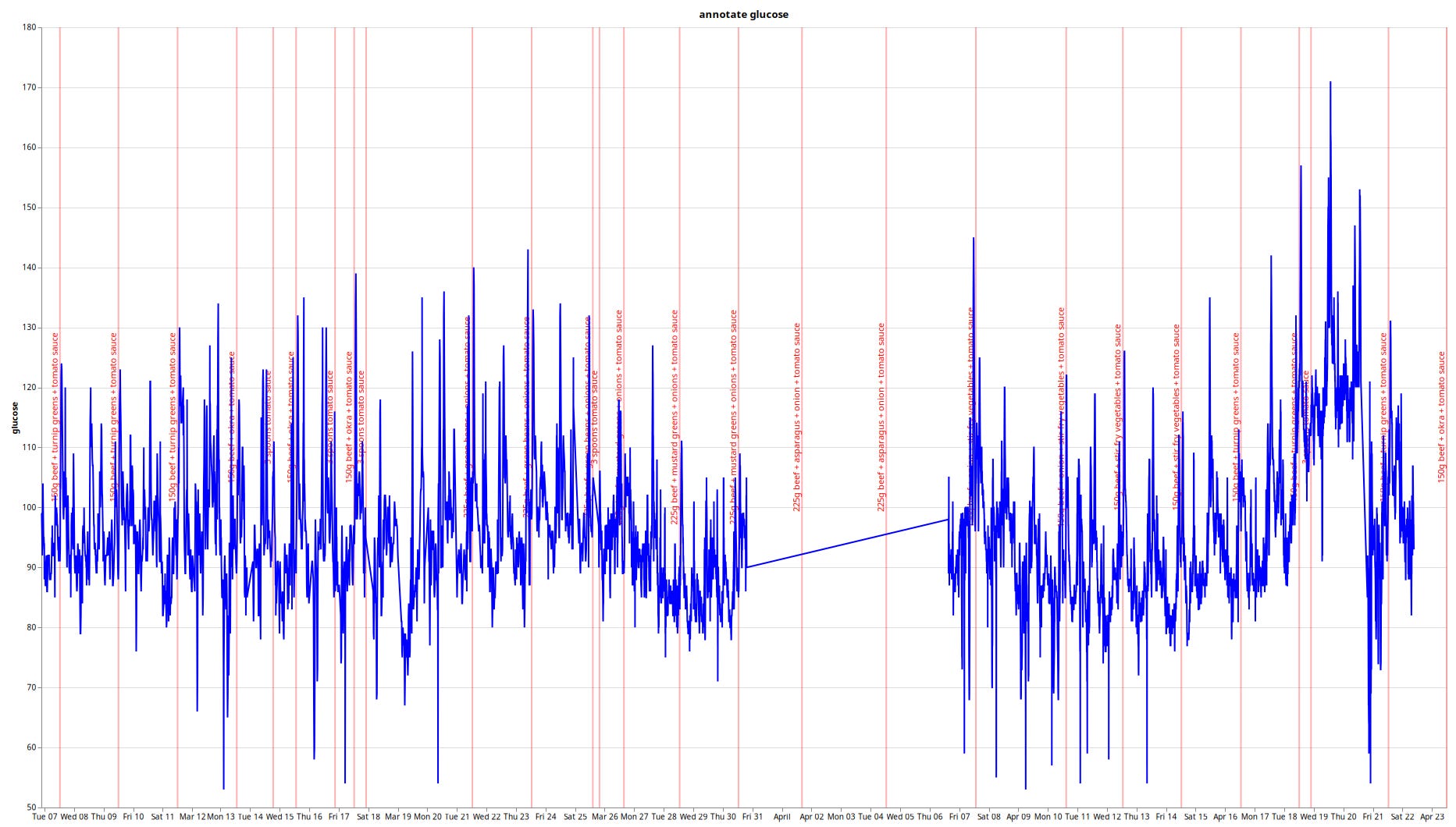
The -s means “show”, -l 50 means “last 50 days.” It’s mostly glucose data in 5-minute intervals, interspersed with an annotation I’ve added here or there. This way, I can correlate what I’ve eaten with blood glucose levels.
You can see the output from this one is structurally the same as the series output, but poorly formatted. That’s because I almost never read it, I just pipe it straight into the graph script…
Oh, what is piping? In Unix shells, the vertical pipe symbol (`|`) lets you connect different programs together. They plug into each other like legos. This allows you to combine many small programs into one bigger, more complex one, as you’re about to see.
graph
This script takes the tabular data format you’ve seen as an input, and turns it into a graph using the VegaLite library. That’s how I generate almost all the graphs you see on this blog.
Because it easily hooks into the series and cgm scripts, it’s very easy to quickly check any correlation or historical data when a random idea pops into my head.
Example usage with cgm data:
$ cgm -s -l 50 | wl tomato | graph -t -l
wl is another script that whitelists all annotations containing, in this case, the word tomato, removing the others. -l makes a line chart. -t means local timezone. (Ask your programmer friend how great timezones are.)
Example usage with series data:
$ series annotate wght wais | wl -r D. | graph -i
Show us the data for annotate, wght, and wais, whitelisting for (D.)iet experiments (and stripping the prefix D. from the resulting markers with -r), in a graph with independent axes for the individual data series.
$ series annotate wght -f date:2023-01-01 \
   | inter cgm -s -l 120 | wl ex1 | graph -l -a 7 -o
And since both series and cgm use the same output format, can we intersperse them both to correlate blood glucose and e.g. weight on the same graph, showing only the 7 day rolling average for each, starting at January 1st of 2023, showing only markers containing the letters ex1 (as in ex150)?
Yes, we can do whatever we want. It’s a Unix system!
Wouldn’t it be nice..
It’s really neat to be able to generate all these charts on the fly. Oh, does my iced vs. hot coffee intake correlate to weight loss (maybe)? What about whipped cream with vs. without instant coffee powder (no)? Does tomato sauce spike my blood glucose more than alfredo sauce (yes)? What about different types of vegetables, do they have different impact on blood glucose (yes)?
But in generating that last graph, I missed one feature. I’d like to be able to configure each data series individually. Currently, I have to choose between line/points for all the graphs, and the colors are just given out randomly. I’d also like to take the 300-data-point rolling average of glucose (5 minute intervals, or 288 entries per day) and no average at all for weight (daily interval) and maybe a 7-day rolling average for waist circumference, which is more noisy. Right now I have to choose one average for all of them, which doesn’t make much sense when there are 288 vs. 1 data points per day.
Guess I’ll have to add those options in the future.
Oh, and before you ask: these scripts are in no condition to be published, or given to anybody. They work on so many assumptions, have so many bugs, and are otherwise only adapted to my personal use-case that it would be a crime to release them.
There’s literally a bug in there that will delete ALL OF THE DATA if you save a file at the wrong time. I haven’t bothered fixing it for nearly a decade now. I just know not to save at the wrong time.
Due to the weird nature of software, it’s easy to write stuff like this for yourself over the weekend. It takes a month to polish it up for one other user. Supporting a few hundred people for a serious use case is a multi-million dollar business. I’m not in the graph-drawing business. I’m in the fat-losing business.
Seriously, you don’t need any of this nonsense
If you couldn’t tell, I enjoy programming. Do you need weird scripts and colorful graphs and rows of tabulated data to lose weight?
Absolutely not. Once again, here’s my basic prescription:
Weigh/tape measure yourself first (or second) thing every morning
Write it down in a text file/spreadsheet/notepad
Good enough to experiment


Thanks for that post. It has been a long time since I wrote code for a living, but I still regularly use vim to write small programs and scripts for tasks like this. Please carry on with your experiments and your writing. It's interesting and informative.
For the non-nerds who want a simple graph I like Cronometer but I have Cronometer Gold so I don't know if the free version tracks weight for you- I'm pretty sure it does though.